Making the web faster and more user-friendly
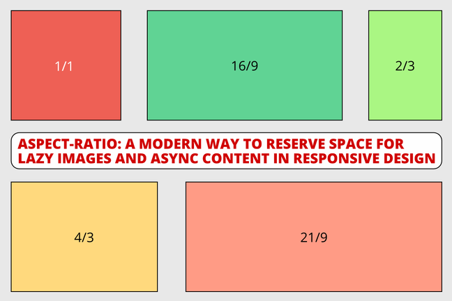
aspect-ratio: A modern way to reserve space for images and async content in responsive design
To avoid layout shifting and optimize for the Cumulative Layout Shift web vital in you web pages, you need to reserve space for any content that might be rendered later in time. This is the case for images, videos and any asynchonously loaded content (e.g with AJAX calls). Here's a new way to do it.

The good old way #
The traditional way to reserve space for images is to use the vertical padding trick.
<div class="image-wrapper">
	<img alt="An image" src="image.jpg" />
</div>
.image-wrapper {
width: 100%;
height: 0;
padding-bottom: 150%;
/* 👆 image height / width * 100% */
position: relative;
}
.image {
width: 100%;
height: auto;
position: absolute;
}The modern way 1 - mapped aspect-ratio #
The modern and simpler way is to define a width / height aspect ratio implicitly by defining the width and height attributes on images and videos. This is called "mapped aspect-ratio".
<img alt="An image" src="image.jpg" width="200" height="300" />

<video alt="A video" src="video.mp4" width="1600" height="900">...</video>
/* Modern browser stylesheets will add a default
aspect ratio based on the element's existing
width and height attributes */
img,
video {
aspect-ratio: attr(width) / attr(height);
}The good news is that either Chromium browsers (Chrome, Microsoft Egde, and Opera), Firefox and Safari (starting version 14) now support mapped aspect-ratio! So the vast majority of browsers is covered, and Internet Explorer is slowly dying, while Microsoft Edge is ramping up.
But there are some caveats when using JavaScript-powered lazy loading.
Demos #
I've created a set of demos on Codepen to test mapped aspect-ratio in different cases.
| Use case | Works? | Demo |
|---|---|---|
| Native lazy loading (no placeholders required) | 🟢 Yes | Demo |
Javascript lazy loading (no placeholders, no display fix) |
🔴 No | Demo |
Javascript lazy loading (no placeholders, with display fix) |
🟢 Yes | Demo |
Javascript lazy loading (SVG placeholders, no display fix) |
🟢 Yes | Demo |
With display fix I mean I needed to set the images display property to block, because leaving its value to the default one (inline-block) didn't work out for Javascript lazy-loaded images.
With "Works?" I mean if the browser reserved space for the images before they were loaded. To check if it works yourself, use your browser's developer tools to disable the cache and emulate a "slow 3G" network speed. You should see some space is reserved before the images start loading, so the paragraph is rendered way below the images.
The modern way 2 - explicit aspect-ratio #
In the future, you will also be able to explicitly set the aspect ratio in your CSS code using the aspect-ratio CSS rule.
<div class="async">Content is loading...</div>.async {
aspect-ratio: 16/9;
}Unfortunately, this has currently (April 2021) supported only by Chromium browsers. We still don't know if and when this will be supported in future versions of Safari.
November 2021 update: this is now supported by all latest versions of all browsers (except for Internet Explorer, but... well).
Conclusion #
Yay! It is possible to use mapped aspect-ratio to reserve space for your lazily loaded content like images and videos today!
Just set the width and height attributes to images and pick one of the following three ways:
- Use native lazy loading with
loading=lazy - Use JavaScript lazy loading with no placeholders, but applying
display: blockto the images - Use JavaScript lazy loading with placeholders
I can't wait to know how you reduced your pages' CLS using these techniques. Please reach out and let me know!