Making the web faster and more user-friendly
How to cap image fidelity to 2x and save 45% image weight on high-end mobile phones

With the rise of very high density “super retina” displays in the newest high-end devices, capping image fidelity to 2x leads to a big improvement in terms of rendering speed, and no perceivable quality loss for your users. Here’s a new best practice on how to do that.
Images x screen densities #
In June 2010, Apple introduced the first Retina display on the iPhone 4. “Retina” is just a fancy name to describe a HiDPI display, which has 2x the pixels horizontally and 2x vertically.
HiDPI displays are perfect when having to render vectors like fonts and SVG images, but when it comes to images, if we don’t provide a specific image for HiDPI displays, our regular image gets stretched to cover all the additional pixels. And stretched images don’t look good.
So the first thing we started doing was to provide both a standard image and an image optimized for Retina displays, using the srcset attribute and the x descriptor. Like this:
<img
	src="batman_1x.jpg"
	srcset="batman_1x.jpg 1x, batman_2x.jpg 2x"
	alt="Batman, Super-man and Wonder Woman"
	width="1280"
	height="720"
/>
That x descriptor in the srcset attribute is to match sources to screen densities. 1x means “this is the image for regular screens”, 2x means “this is the image for HiDPI / Retina displays”. Depending on the device’s screen, browsers will pick the corresponding source.
Responsive images #
Responsive images is an HTML specification that allows us to serve the correct image size to users, depending on the space the image occupies on the user’s screen, and taking the device pixel ratio into account.
The simplest way to code responsive images is to list all the image sizes we have in a srcset attribute, using the w descriptor, and tell the browser how big is our image, using the sizes attribute. Browsers will do the math and will download the most appropriate image.
<img
	src="batman_1280w.jpg"
	srcset="batman_1280w.jpg 1280w, batman_1024w.jpg 1024w, batman_768w.jpg 768w"
	alt="Batman, Super-man and Wonder Woman"
	sizes="100vw"
/>
Additionally, when the size of your images changes depending on media queries, we can add the same media queries in the sizes attribute.
<img
	src="batman_1280w.jpg"
	srcset="
		batman_1440w.jpg 1440w,
		batman_1280w.jpg 1280w,
		batman_1024w.jpg 1024w,
		batman_768w.jpg   768w
	"
	alt="Batman, Super-man and Wonder Woman"
	sizes="(min-width: 640px) 50vw, 100vw"
/>
If you feel confused, I recommend you to read Srcset and Sizes from Eric Portis. That article lighted my way when I was starting to play around with responsive images.
Devices with 3x displays #
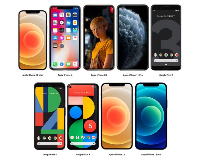
At the time I am writing this article, there's a bunch of high-end devices, both from Apple and Google, mounting a HiDPI display with 3x pixel density or more. Apple calls them Super Retina displays, Google calls them FHD+ displays.

Apple launched their first Super Retina display with the iPhone X, the same kind of display is mounted in the iPhone XS / Max, iPhone 11 Pro / 11 Pro Max, and on all the phones in the iPhone 12 line-up, including the 12 Mini.
Google Pixel phones have their FHD+ displays with a 3x pixel density, and QHD+ displays with a pixel density of 3.5x on the Pixel 4 XL.
Capping image fidelity #
According to the analysis on a Twitter mobile app change, capping image fidelity to 2x leads to a significant improvement in terms of rendering speed and no perceivable quality loss for your users.
Images in timelines on ultra-high resolution devices now load roughly 33% faster while using 1/3rd less data, and with no visible quality change.
The problem with doing responsive images using the img tag, as we saw above, is there is no way to stop browsers from downloading the 3x image. The reason is that to determine which image to download from the srcset, they do the following calculation:
width of the image on screen × device pixel density = width of the image to download
So for example, if an image has to be displayed at a width of 300px on an iPhone 12, browsers would do the following calculation:
300 × 3 = 900
And they would download the 900-pixels-wide image. What we want is to cap the fidelity to 2x so that it downloads the 600-pixels-wide image instead.
The only way to do that on the web is to use the picture tag like the following:
<picture>
	<!-- Landscape tablet / computers -->
	<source
		media="(min-width: ####px)"
		srcset="batman_###w.jpg 1x, batman_###w.jpg 2x"
	/>
	<!-- Portrait tablet / landscape smartphone -->
	<source media="(min-width: ###px)" srcset="batman_###w.jpg 2x" />
	<!-- Larger smartphone(s) -->
	<source media="(min-width: ###px)" srcset="batman_###w.jpg 2x" />
	<!-- Smallest smartphone -->
	<img
		src="batman_###w.jpg"
		srcset="batman_###w.jpg 2x"
		alt="Batman Super-man and Wonder"
	/>
</picture>
Note: I replaced the real numbers with a ### placeholder because those numbers are not relevant to this explanation.
Notice that:
- on the smartphones media queries, we describe only the
2ximage because all smartphones mount a retina display nowadays - on the landscape, tablet and computers media query, we should describe both the
1xand2ximages. - the
srcattribute on theimgtag is required, but it will be used only by legacy browsers, IE 11 included
Optionally reduce complexity on tablets and computers media queries #
If your layout requires you to do more than 1 media query for tablets and computers, you should then consider using the srcset attribute with the w descriptor and the sizes attribute, which leads to this:
<picture>
	<!-- Landscape tablet / computers -->
	<source
		media="(min-width: ###px) "
		sizes="(min-width: ###px) 33vw, 50vw"
		srcset="
            batman_####w.jpg ####w,
            batman_####w.jpg ####w,
            batman_###w.jpg   ###w
        "
	/>
	<!-- Portrait tablet / landscape smartphone -->
	<source media="(min-width: ###px)" srcset="batman_###w.jpg 2x" />
	<!-- Larger smartphone(s) -->
	<source media="(min-width: ###px)" srcset="batman_###w.jpg 2x" />
	<!-- Smallest smartphone -->
	<img
		src="batman_###w.jpg"
		srcset="batman_###w.jpg 2x"
		alt="Batman Super-man and Wonder"
	/>
</picture>
In this way, from the landscape tablets and computers media query and above, you won’t need to add other source tags, because there’s no need to cap image quality on computers. The upmost source tag does the trick.
“That’s a lot of markup for one image”, you say? #
If you are using responsive images you probably already have considerably large img tags, each one listing a set of image URLs in the srcset attribute, and a set of media queries and sizes in the sizes attribute. The code listed above can be slightly larger, but not significantly.
That said, tools like GZip and Brotli — which are working out of the box in most applications servers and CDNs — do a great job at compressing repeated characters in markup, and there are lots of repeated characters in those image tags.
I did a test and I found out that an HTML file containing 54 images weighs 37 kb uncompressed, but it only weighs 530 bytes GZipped. If you compare this to the 45% data savings on the downloaded images, that’s probably a good trade-off.
Result: 45% lighter images #
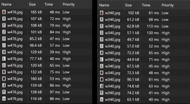
Using this technique on the product listing page of one of the websites we manage led to an image weight reduction of 45%. Images weight on an iPhone 11 Pro was 1.7 Mb before and it’s only 949 kb after the capping.

Demos #
I’ve created a GitHub repo and a Codepen. Feel free to try and fork them.
Single image with fidelity capped to 2x:
Or try the page shown in the video above.
Psst! You can still lazy-load images #
One of the best practices to minimize your website’s Largest Contentful Paint is to eagerly load the above-the-fold images, lazy load below-the-fold ones. You can do that by using data-src, data-srcet, data-sizes instead of src, srcset, sizes both in the img and in the source tags.
<picture>
	<!-- Landscape tablet / computers -->
	<source
		media="(min-width: ###px) "
		data-sizes="(min-width: ###px) 33vw, 50vw"
		data-srcset="
            batman_####w.jpg ####w,
            batman_####w.jpg ####w,
            batman_###w.jpg   ###w
        "
	/>
	<!-- Portrait tablet / landscape smartphone -->
	<source media="(min-width: ###px)" data-srcset="batman_###w.jpg 2x" />
	<!-- Larger smartphone(s) -->
	<source media="(min-width: ###px)" data-srcset="batman_###w.jpg 2x" />
	<!-- Smallest smartphone -->
	<img
		data-src="batman_###w.jpg"
		data-srcset="batman_###w.jpg 2x"
		alt="Batman Super-man and Wonder"
	/>
</picture>
More about lazy loading responsive images.
To wrap up #
In web design with responsive images, capping image fidelity on super HiDPI devices is a relatively new best practice, because of the growing number of smartphones spoiling super HiDPI displays.
Capping image fidelity will improve the rendering speed of your website, as well as your users’ experience and your pages’ Largest Contentful Paint metric.